Measuring the number of pedestrians and cyclists is a crucial first step.
But for these data to become really useful for planning, planning or daily management, you still need to know how to analyze them.
Here are 7 concrete tips — based on field experiences and institutional recommendations (Bike & Territories, CEREMA, SDES...) and best practices — to make the most of your data.
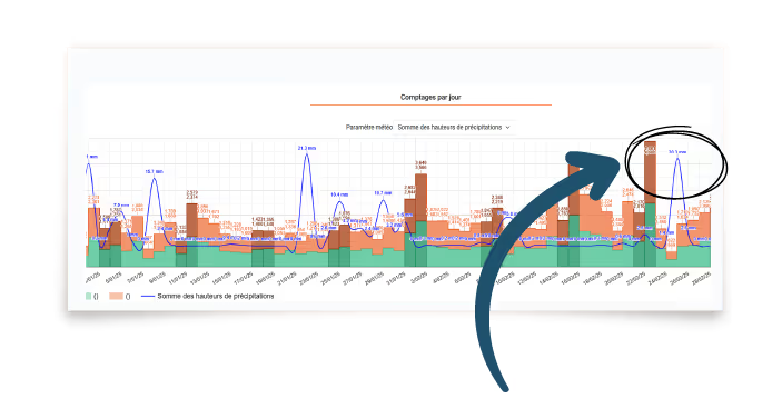
An exceptional day may not be exceptional... if it corresponds to a holiday or a local event. Integrating the calendar context (school vacations, extended weekends, weather, local events) makes it possible to correctly interpret peaks or troughs.
According to Vélo & Territories, the use of bike paths can drop by 30 to 60% on rainy days, and increase by up to +80% during a sunny weekend.
► For communities: Cross-referencing this data with scheduled events makes it possible to anticipate attendance and adapt services (maintenance, security, signage).
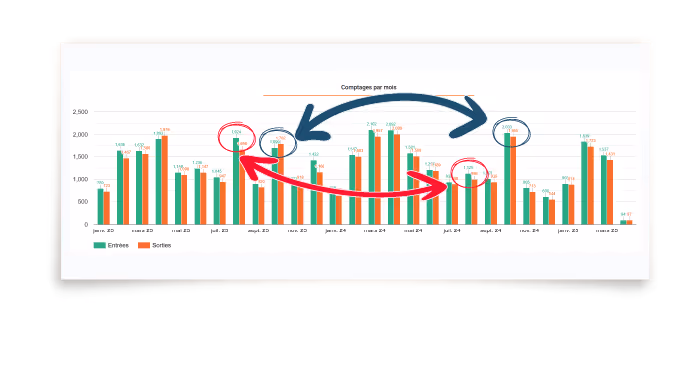
Comparing April to January makes little sense. To assess the impact of a development or to monitor changes, it is necessary to compare equivalent periods: same month, same day of the week, similar weather conditions.
CEREMA recommends comparing “before-and-after” data over at least two weeks per period.
► For managers of natural or tourist sites: this makes it possible to check whether an equipment (parking, trail, shuttle) really meets the evolution of attendance.
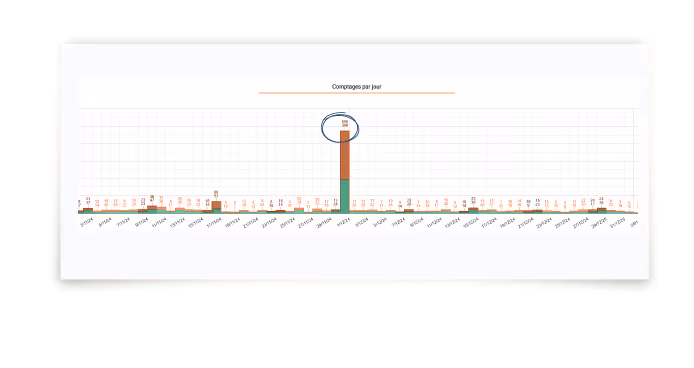
A peak in attendance, an unexpected low? Atypical values can reveal specific uses, points of tension or opportunities to be seized.
On a busy greenway, a peak of +150% was observed on an extended holiday. This peak led to the rethinking of the main access, a source of congestion and conflicts of use.
► For event organizers: this makes it possible to adjust entrances and exits, to reinforce reception or security on critical days.
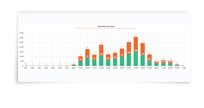
The temporality of flows makes it possible to understand the uses:
The Active Mobility Barometer (SDES) indicates that 60% of urban cycling trips take place before 9 am and after 5 pm during the week.
► For urban planners: this hourly reading makes it possible to design safe itineraries at the right times.
► For mountain managers: this makes it possible to identify the areas where the tracks are overused.
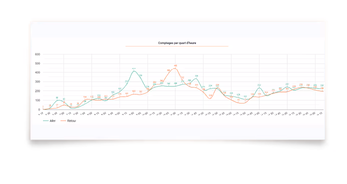
Two-way counters make it possible to distinguish between trips and returns, and therefore to refine the reading:
A station manager observed very asymmetric attendance on a marked loop: 80% of users took the opposite direction to the markings. Result: a reconfiguration of the departure streamlined the flows.
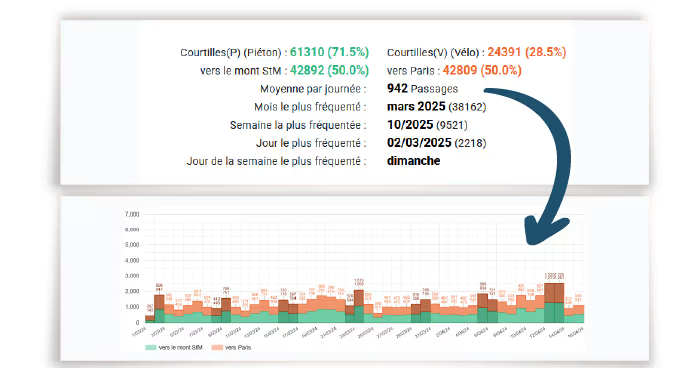
An annual average can hide the essentials:
An average of 400 passes/day can give the illusion of regular use, while reality shows critical peaks, sources of tension or occasional overload.
► For green space managers: It is better to reason in time slots or target days to adjust maintenance, safety or equipment.
Data is valuable, but never a substitute for real observation:
A community discovered, thanks to a sudden drop in flows, that an informal crossing had been closed without communication. Attendance has recovered after reorganization and adapted signage.
► Involve technical agents, site managers or users enriches reading and validates hypotheses.

Analyzing attendance properly means transforming raw data into informed decisions.
For local authorities, managers of natural or cultural sites, and mobility operators, it is a lever for:
✅ Plan better
✅ Adapting services
✅ Justify investments
✅ Improve the quality of use
From collection to interpretation: counting, analysis, visualization.
We transform your flows into management levers.
📩 Want to discuss it? Contact us.
🧠 To manage a territory well, you must start by understanding it.


.svg)